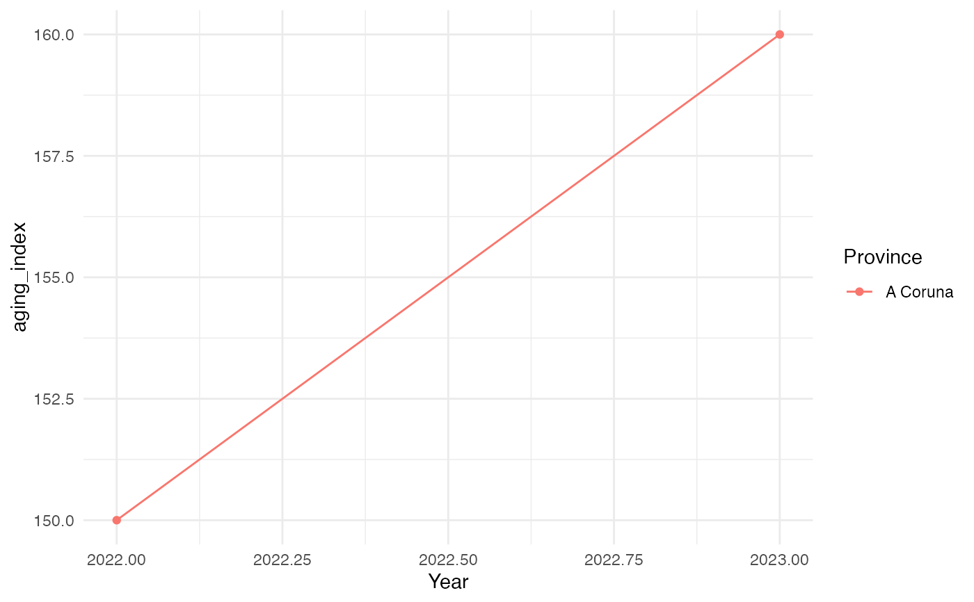
Generic time-series line chart for any indicator tibble keyed by
nuts3_code/province_name/year, such as the output of
age_dependency_ratio(), aging_index(), sex_ratio(),
crude_birth_rate(), or life_expectancy_summary().
plot_demog_trend(df, value_col, region = NULL, title = NULL, ylab = NULL)Arguments
- df
A tibble with
province_name,year, andvalue_col.- value_col
Character, the name of the column to plot.
- region
Optional character vector to subset by province name (regular expressions allowed, matched against
province_name); one line is drawn per matched province. IfNULL(default), every province present indfis plotted.- title
Optional plot title.
- ylab
Optional y-axis label (defaults to
value_col).
Value
A ggplot object.