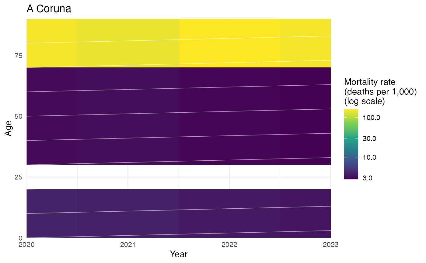
Builds the classic demographic Lexis surface — age (y-axis) by
calendar year (x-axis), shaded by mortality rate, with birth-cohort
diagonals overlaid — for one province, from the age x year central
death rates already computed by compute_death_rates(). Operates on
data already retrieved/computed via the mortality pipeline
(get_ine_deaths() -> compute_exposure() -> compute_death_rates());
it does not fetch anything itself.
plot_lexis_diagram(
  mx_df,
  province,
  sex = c("total", "female", "male"),
  log_scale = TRUE,
  rate_per = 1000,
  cohort_lines = TRUE,
  cohort_step = 10,
  title = NULL
)
Arguments
- mx_df
Output of the
mx_1x1element ofcompute_death_rates()(columnsnuts3_code,province_name,year,age,mx_female,mx_male,mx_total).- province
Character, a province name (regular expressions allowed, matched against
province_name— same convention asregioninplot_population_pyramid()). Must match exactly one province.- sex
Character, one of
"total","female","male".- log_scale
Logical (default
TRUE), color-scale mortality rates on a log10 scale — the standard convention for Lexis surfaces, since mx spans several orders of magnitude across ages.- rate_per
Numeric, express the mortality rate as deaths per this many people (default
1000, the standard demographic convention — e.g. a legend value of10reads as "10 deaths per 1,000 population"). Use1for the raw per-person rate.- cohort_lines
Logical (default
TRUE), overlay birth-cohort diagonals (age = year - cohort).- cohort_step
Numeric, spacing in years between overlaid cohort diagonals (default
10).- title
Optional plot title (defaults to the matched province name).
Value
A ggplot object.
Details
"Calculate" here means deriving the tidy age x year surface for the
requested province/sex and the cohort-diagonal positions to overlay
(age = year - cohort, for cohorts every cohort_step years across the
data's range) — not fitting a new mortality model; the rates
themselves come straight from compute_death_rates().
The white diagonal lines are intentional, not an artifact. They
are birth-cohort lines (age = year - cohort): every point along one
line represents the same group of people born in the same year, aging
one year for every calendar year that passes — the defining feature of
a Lexis diagram, letting you trace one cohort's mortality experience
across its lifetime instead of only reading across a fixed year or up
a fixed age. Set cohort_lines = FALSE to turn them off.
Grey cells mean no rate could be computed for that age x year cell, almost always because the source population data has no single-year age breakdown for the oldest ages in the earliest years of the series (so exposure, the rate's denominator, is missing there) — not a bug in the calculation. This typically shows up as a rectangular block in the upper-left (oldest ages, earliest years), clearing up once the source data's age detail becomes complete. When present, grey gets its own "Missing data" legend key (a continuous color scale can't show this on its own, so it's added via a small dummy layer).